the wave of the future
 If you want to get more out of your words, you need to make the written word interesting to read...brighten up the way it is presented. For example:
But most importantly - in this visual age - you've got to use graphics. Photographs, illustrations, line drawings, graphs, screenshots, video. They all help to make the web page more interesting and powerful.
In this blog - and more particularly my lotto blog - I've started using graphics in a big way. Take a look at my Honest Lotto System blog.
If you don’t have material from your own resources, you can get plenty of royalty-free photos and illustrations here:
- yotophoto.com
- sxc.hu
- morguefile.com
I use Photoshop to scale down full-size graphics, but you can also use a free service called JPEG Wizard
If you use Google's Blog to produce your blog, you can pull graphics files straight off your hard drive and have them automatically sized by this system.
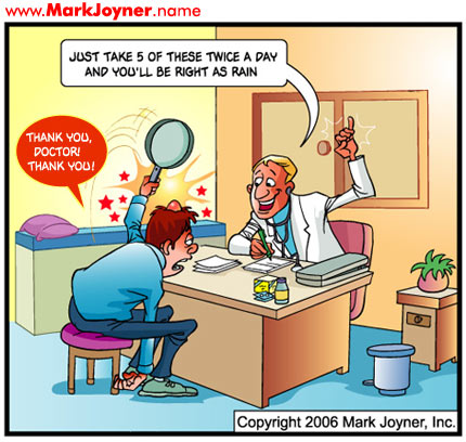
Marketer Mark Joyner uses a daily cartoon and a small accompanying message in his blog. He relies on a link to his forum to generate discussion.
I believe this is the wave of the future... video and graphic illustration will become more powerful now that broadband is relatively cheap.
Don't underestimate the power of a picture!

1 comment:
Yeah, everyone and his donkey tells me that I should add graphics.
But I find the time needed vs value added payoff not high enough.
Don't think my audience cares anyway.
Post a Comment